 class       : SpatVector
 geometry    : polygons
 dimensions  : 76, 6  (geometries, attributes)
 extent      : 493675.9, 691460, 8591761, 8964834  (xmin, xmax, ymin, ymax)
 coord. ref. : Arc 1950 / UTM zone 36S
 names       : TA_CODE DIST_CODE poor_ebp poor_ebp_var poor_dir poor_dir_var
 type        :   <chr>     <chr>    <num>        <num>    <num>        <num>
 values      :   10120       101   0.2175      0.07543   0.3177       0.1326
                 10110       101   0.4475       0.3654       NA           NA
10102 101 0.3263 0.05838 0.3463 0.08992Mapping poverty
8 Mapping poverty
Our final step is to map the results. We can do this by joining the estimated poverty rates to the admin3 shapefile. Let’s first load the shapefile and then join the results:
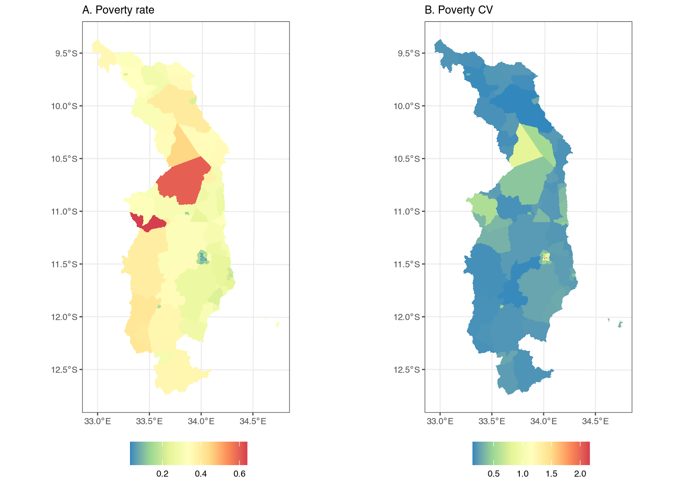
Finally, we can map poverty rates and standard errors. Specifically, let’s map the poverty rate and the coefficient of variation, which is defined as the standard error divided by the mean. Here is the code:
g1 <- ggplot() +
  geom_spatvector(data = admin3, aes(fill = poor_ebp), color = NA) +
  scale_fill_distiller("", palette = "Spectral") +
  labs(subtitle = "A. Poverty rate") +
  theme_bw()
g2 <- ggplot() +
  geom_spatvector(data = admin3, aes(fill = poor_ebp_var/poor_ebp), color = NA) +
  scale_fill_distiller("", palette = "Spectral") +
  labs(subtitle = "B. Poverty CV") +
  theme_bw()
And the output is in Figure 1. One thing to note is that the CV can be somewhat misleading in areas with very low poverty rates. This is particularly true in the capital of Northern Malawi, where poverty rates are below 0.1, leading to some of the highest CVs in the region.